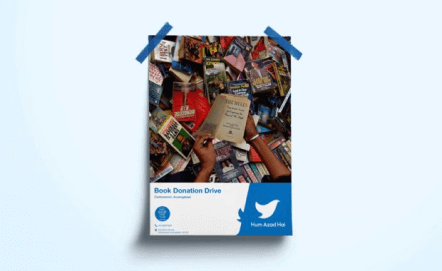
Undertaking social work is never about income, it’s about outcome. It’s about making an impact. Today’s world needs your contribution in any way possible. Hum Azad Hai is all about that.
About The Client
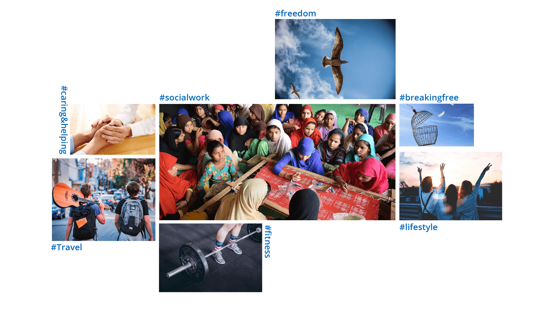
Hum Azad hai is a welfare foundation based in Aurangabad, Maharashtra. The key features of its work involve social service, travel, fitness and most importantly, freedom. The objective of Hum Azad Hai is the well-being of the underprivileged and also personal well-being.
The Old Identity


The Challenge
From the name of the organisation, it’s evident that the new identity should depict freedom. Its other major attributes are social work, travel, fitness & lifestyle.
In the exact words of the client, they wanted their new brand identity to be ‘damn simple and elegant’. The identity needed to be so simple that any person, even a child, would be able to recall it and draw it.
The Development
Since the core keyword for the brand identity was ‘freedom’, the element which best describes freedom must be present. And that element is a bird, which was depicted in the earlier logo as well
The Moodboard
Setting the tone for the new brand identity.

The New Logo


The act of attaining freedom is the crux of the new identity. The slumped rectangular element represents a weakened or burdened society, from which the bird breaks free. It also represents all the other qualities of the brand – lifestyle, fitness, travel and social service.
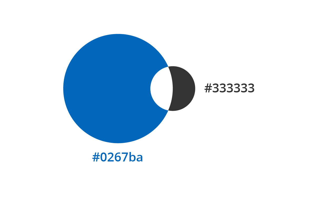
The Brand Colours
Sky’s the limit. We all look up towards the sky. We all aim to go higher and higher. It’s where birds soar freely. This is why blue is chosen for the brand. Blue also reflects trust, loyalty, wisdom, confidence, truth and faith. Blue is considered to be virtuous to the mind, body and soul.

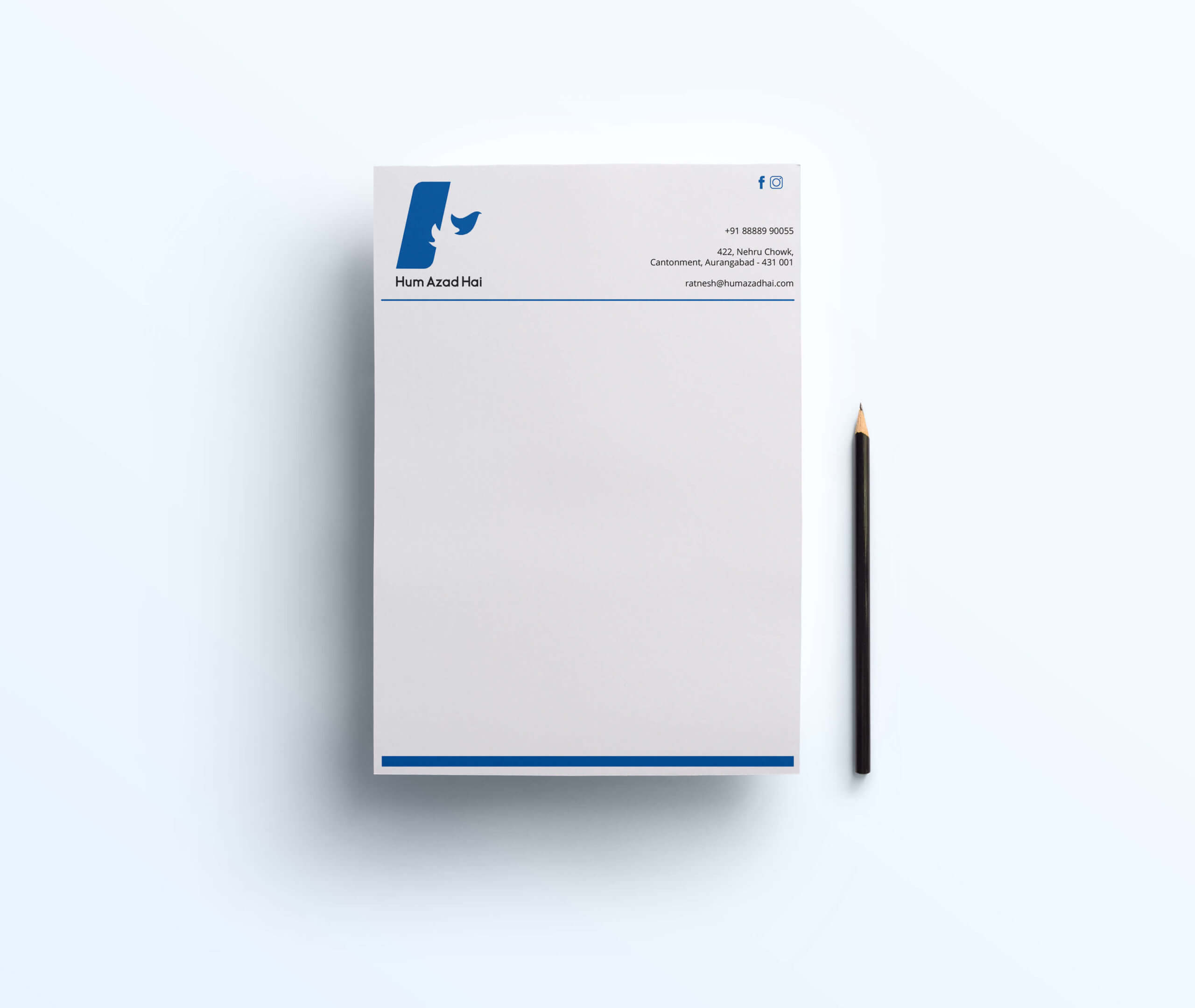
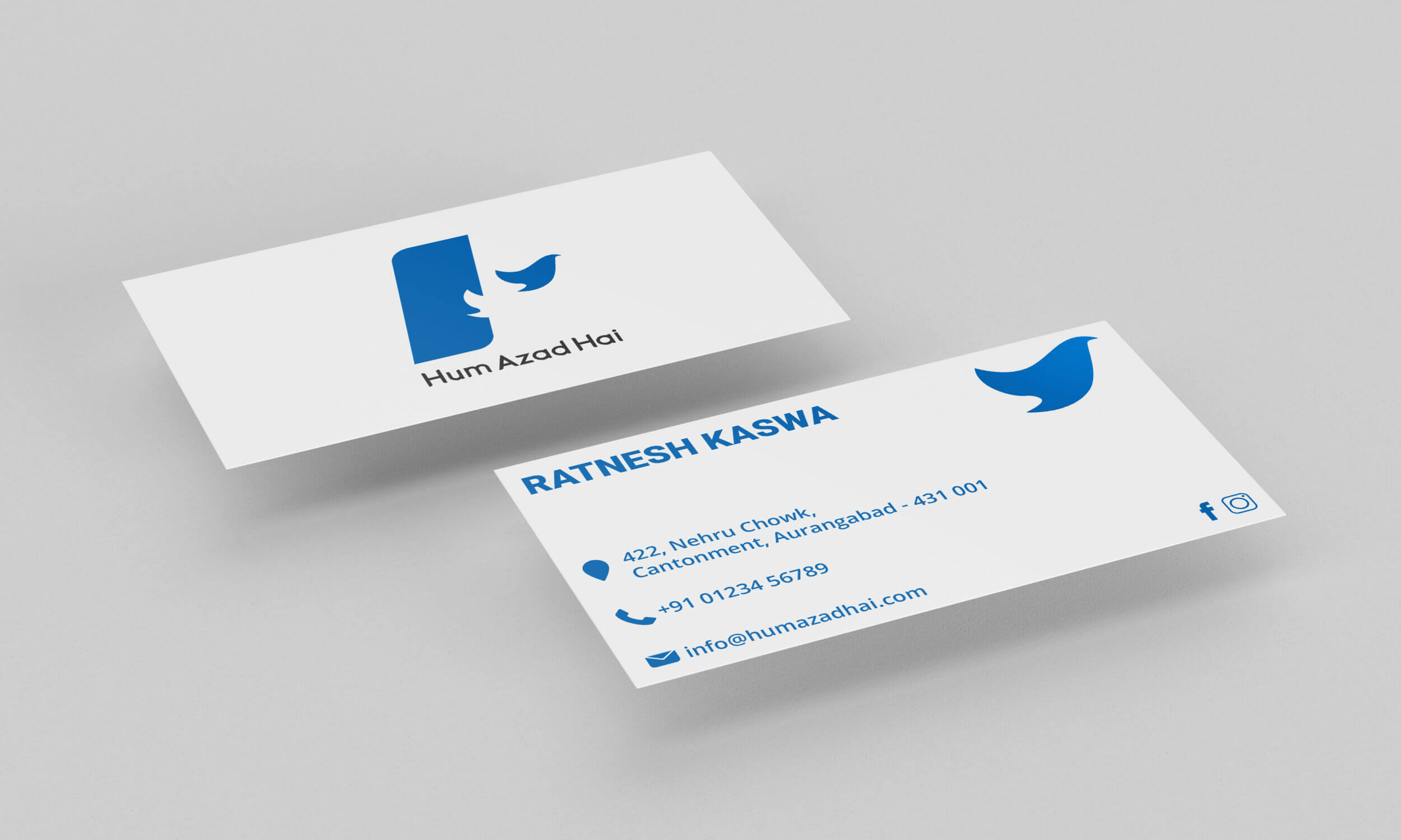
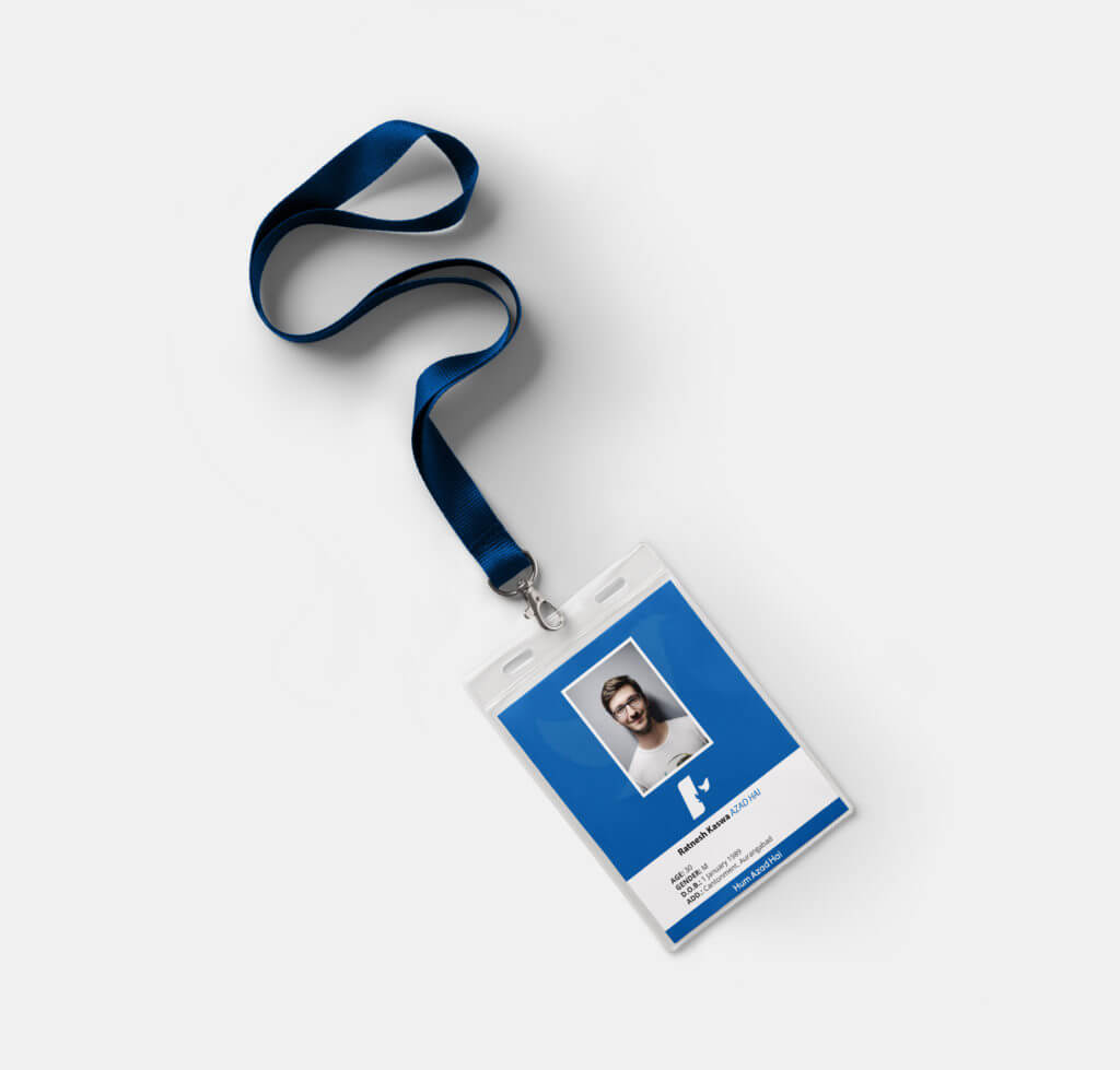
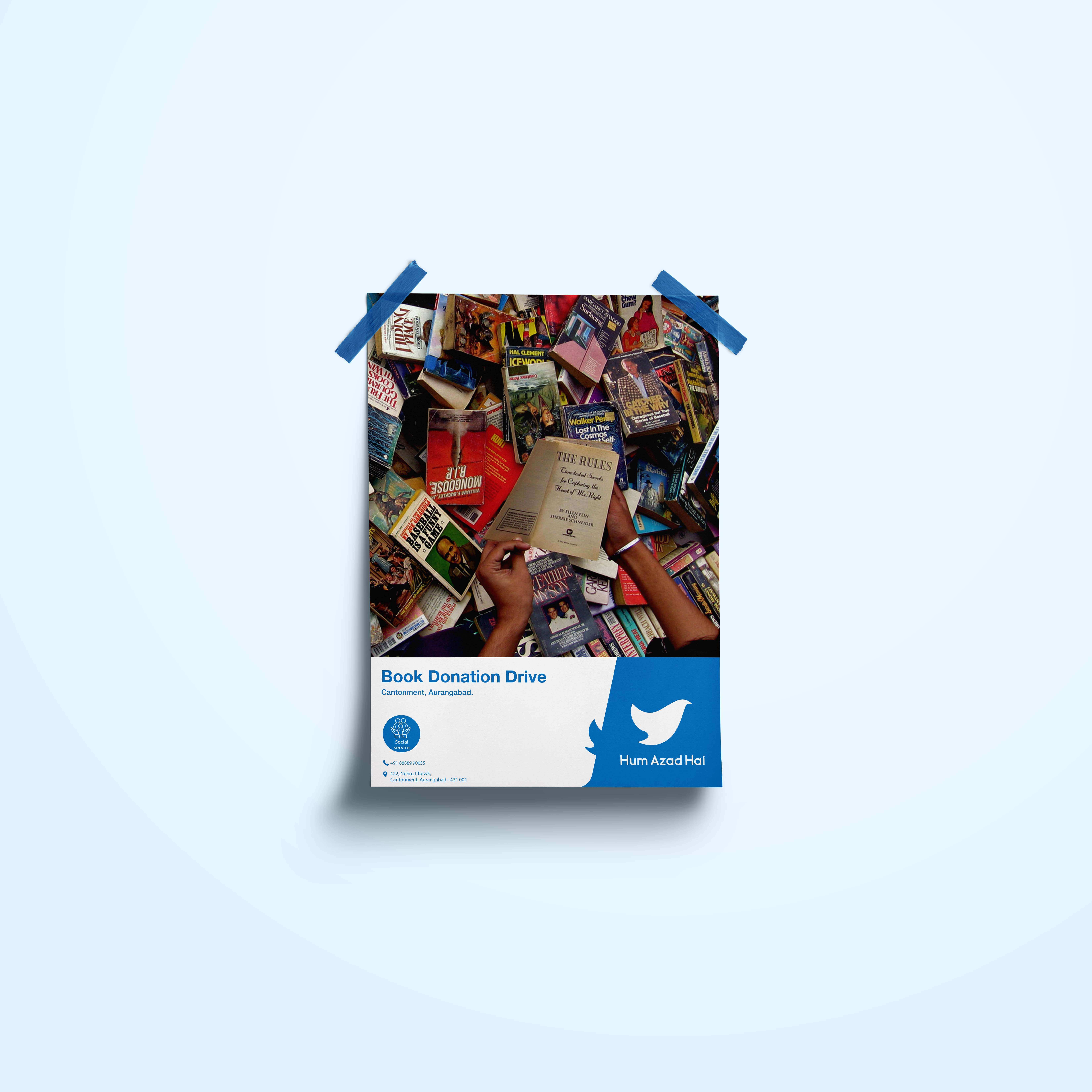
Behold…The New Identity