“Investments”
“Mutual Funds”
“Corporate Fixed Deposits”
“Capital Gains Bonds”
“Investments are subject to market risks. Please read offer document carefully before investing.”
Didn’t you think of these as something very complicated? That’s the mindset StepUp Investments wants to change.
About The Client
StepUp is an investment firm that’s dedicated towards helping us achieve our financial goals. How do they do it smoothly and seamlessly? Through systematic planning and guidance.
To start with, they enlighten us all with the benefits of investment. They want to show us that investment is something everyone can and should do. That’s their purpose for being our financial partners.
The Challenge
‘StepUp’ is a short yet apt description. On the drawing board was a task to create a brand identity that reflected the purpose. When you think of a company that deals with money, investment, bonds, and capital, you might not imagine a friendly and approachable identity.
We, together with the team at StepUp, decided that the brand identity should turn this around. We needed a friendly and approachable identity, while still showing that it’s an investment company and they mean business.
The Development
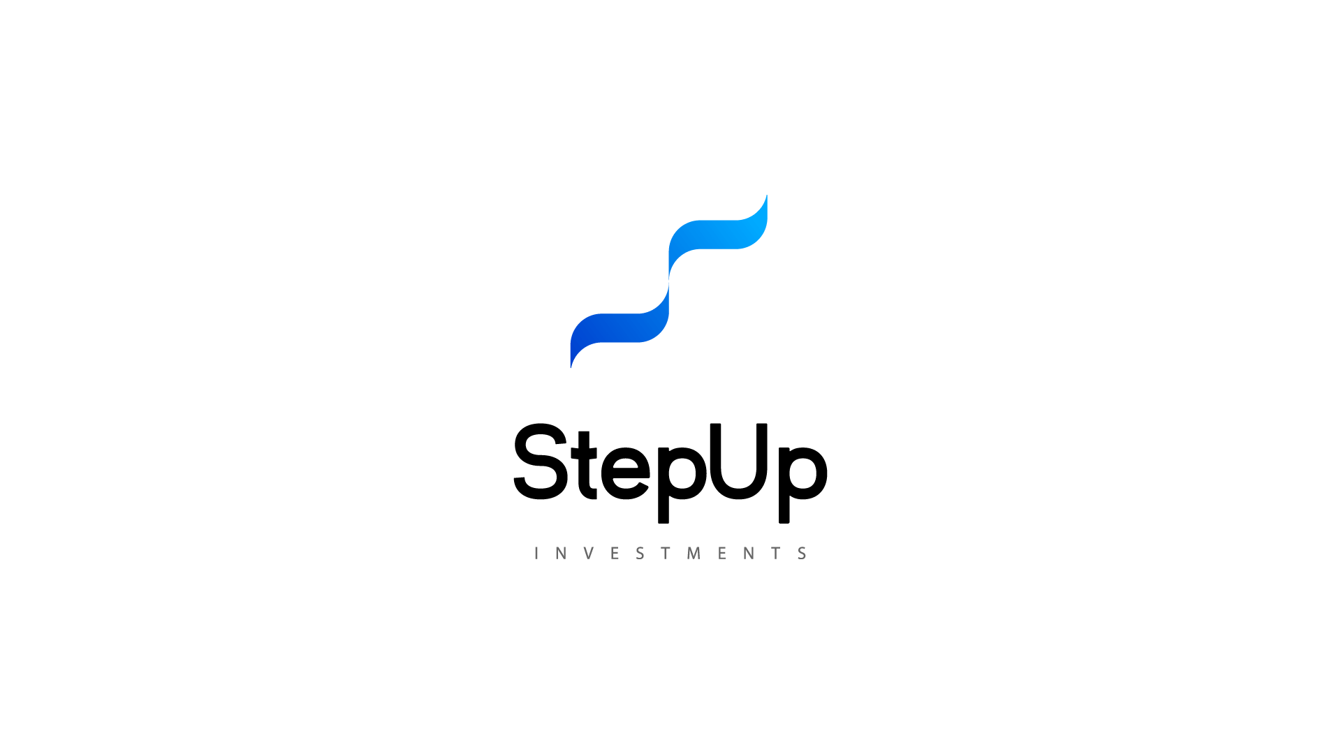
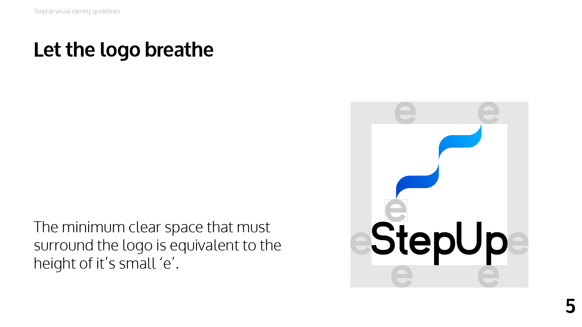
The core keyword for the identity is the name itself, ‘StepUp’. The development involved exploring ways to represent ascending or stepping-up in a minimal way.
The Moodboard
Setting the tone for the new identity.


Determining the 3 key elements of the logo.


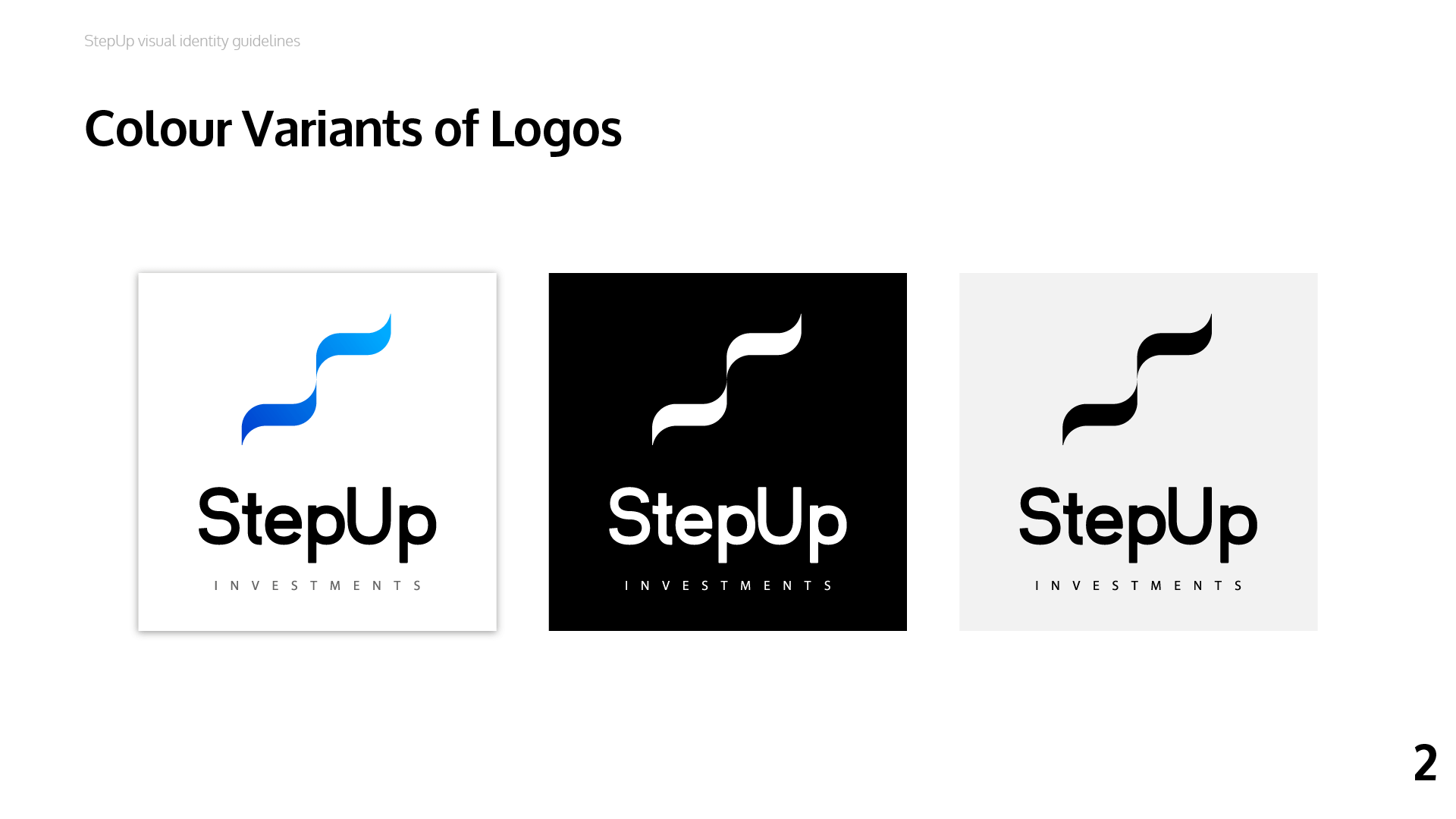
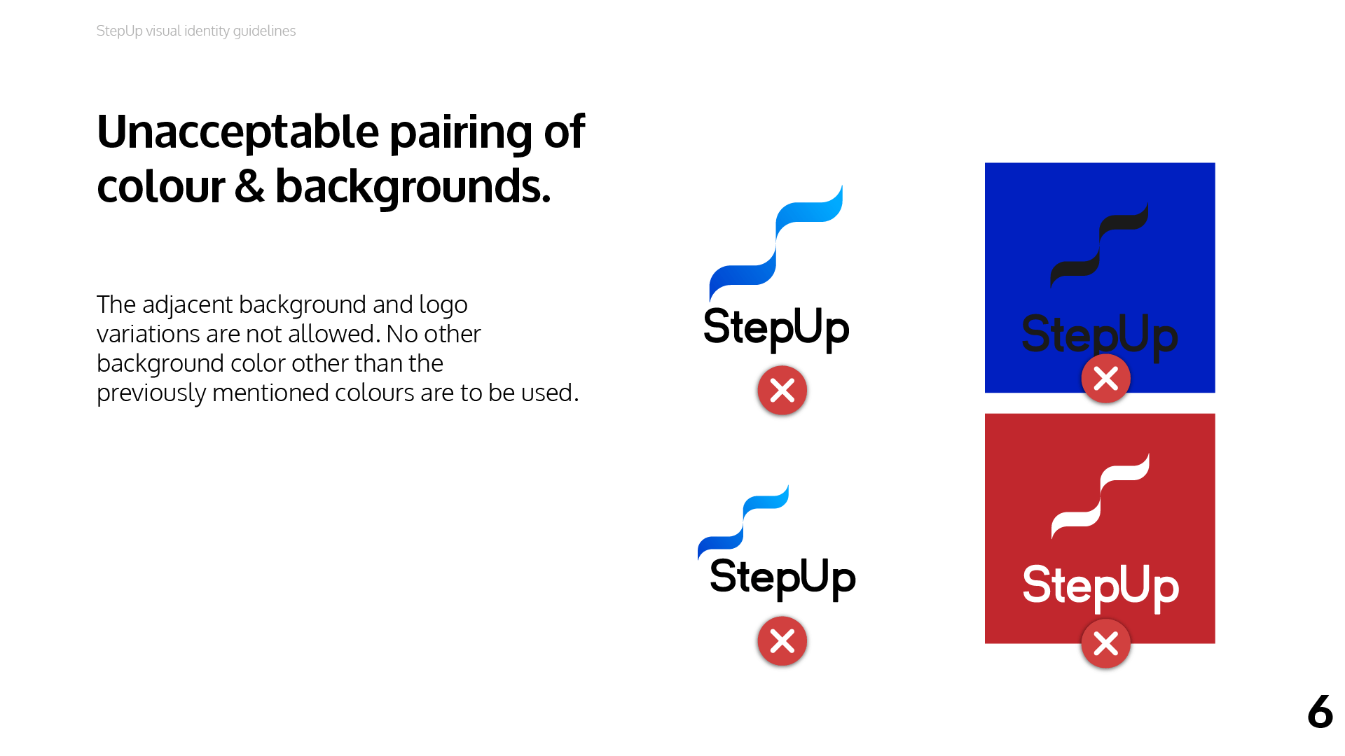
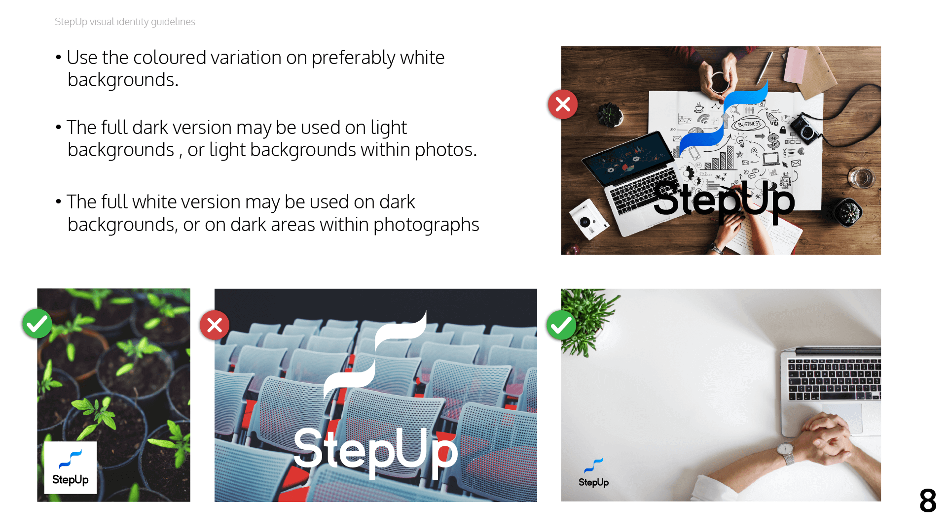
The Brand Colours
We chose blue, as it represents trust, loyalty, wisdom, confidence, truth and faith. Last but not the least, a lively blue colour emanates friendliness. It represents everything an investment firm should be.


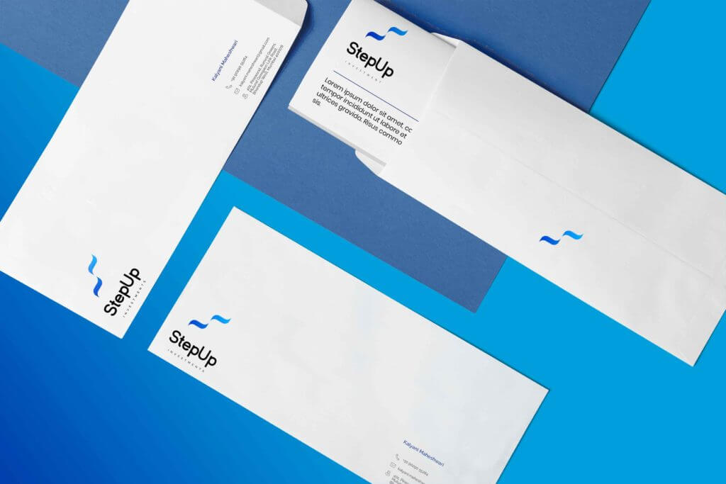
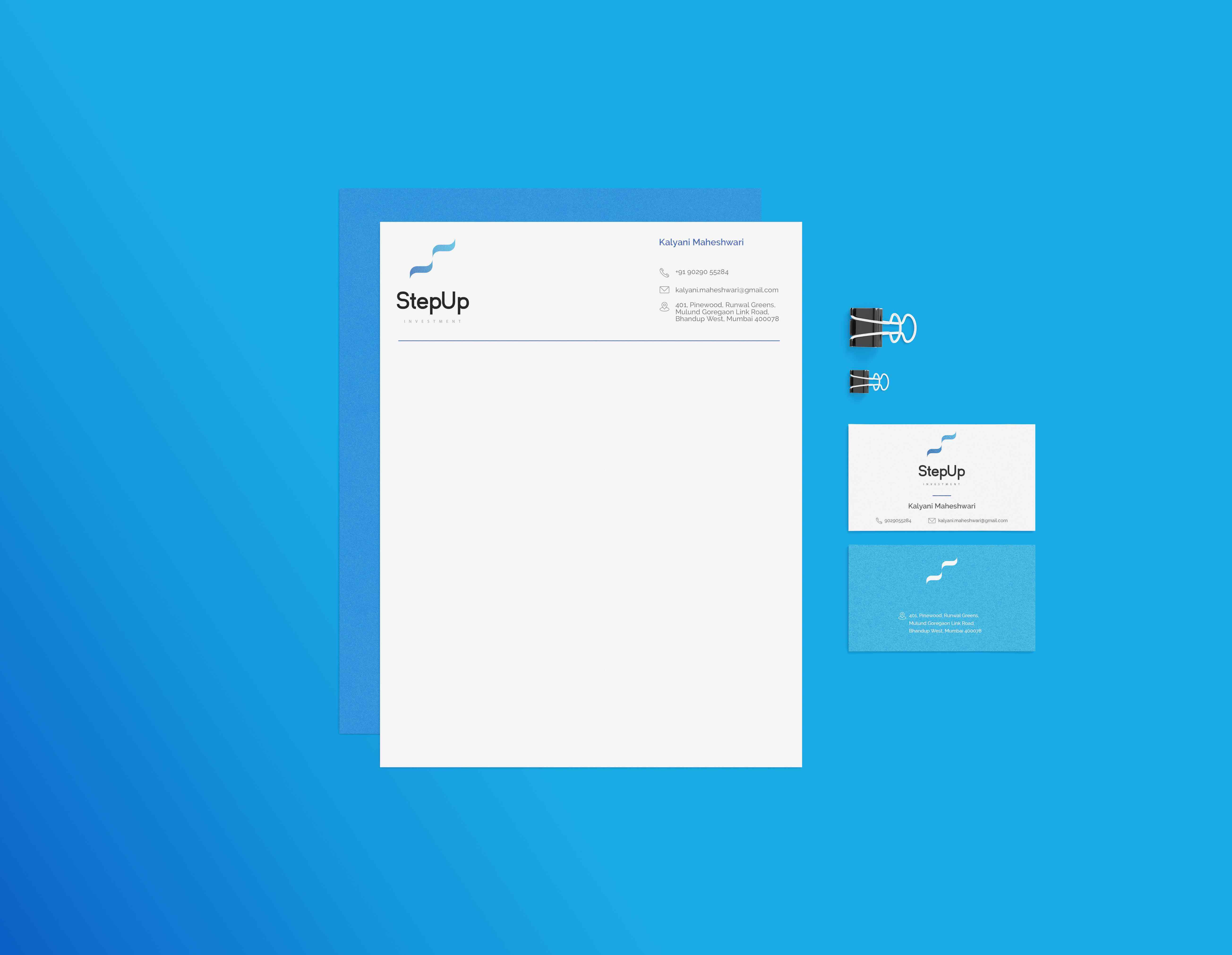
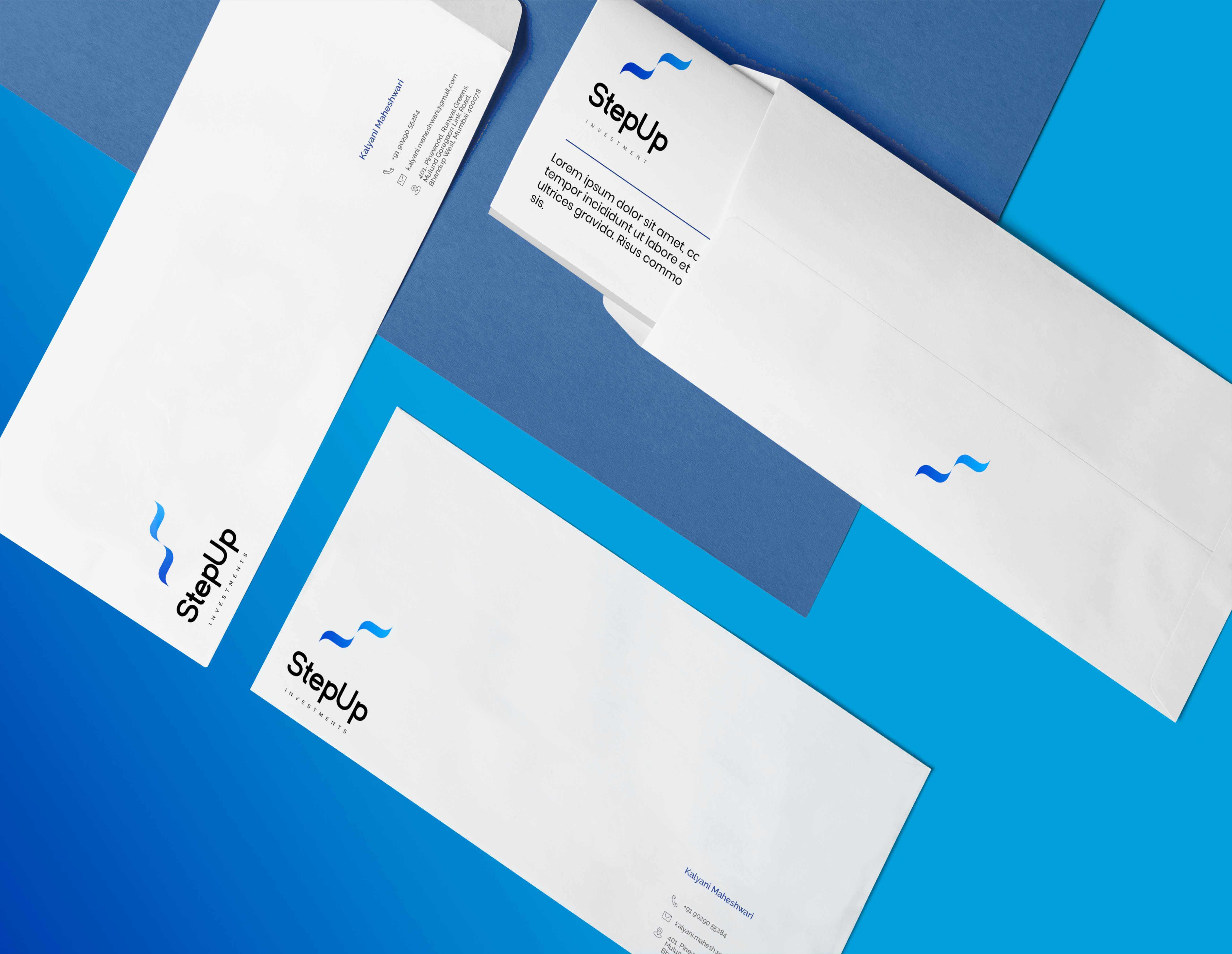
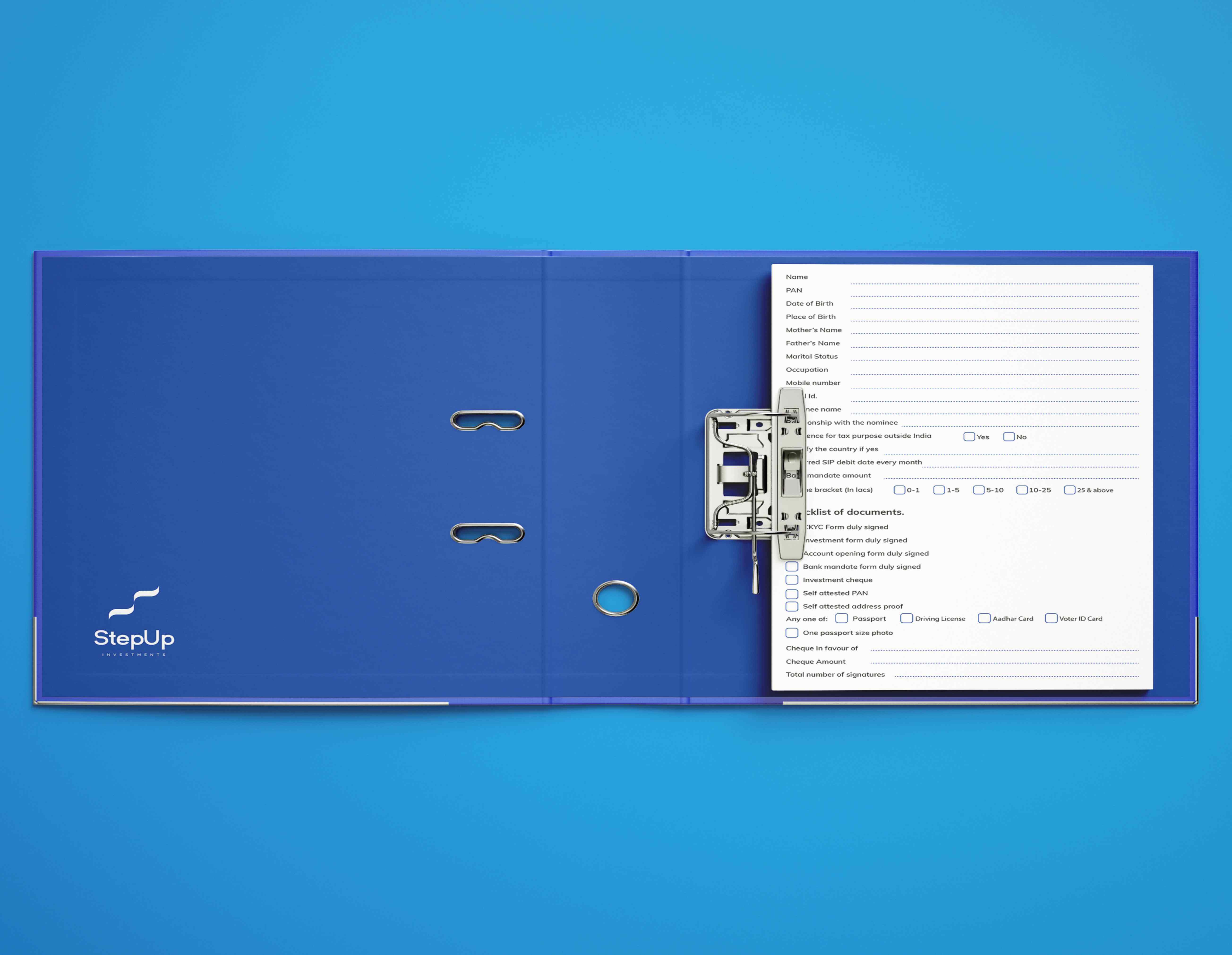
There You Have It… The New Identity


The Brand Book

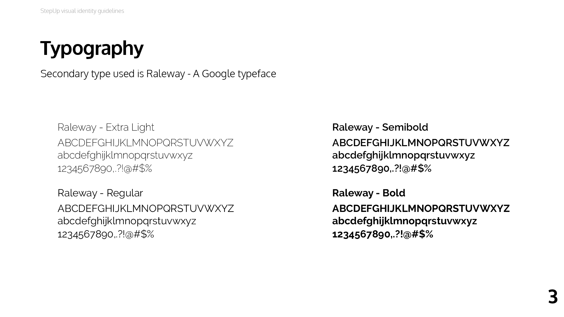
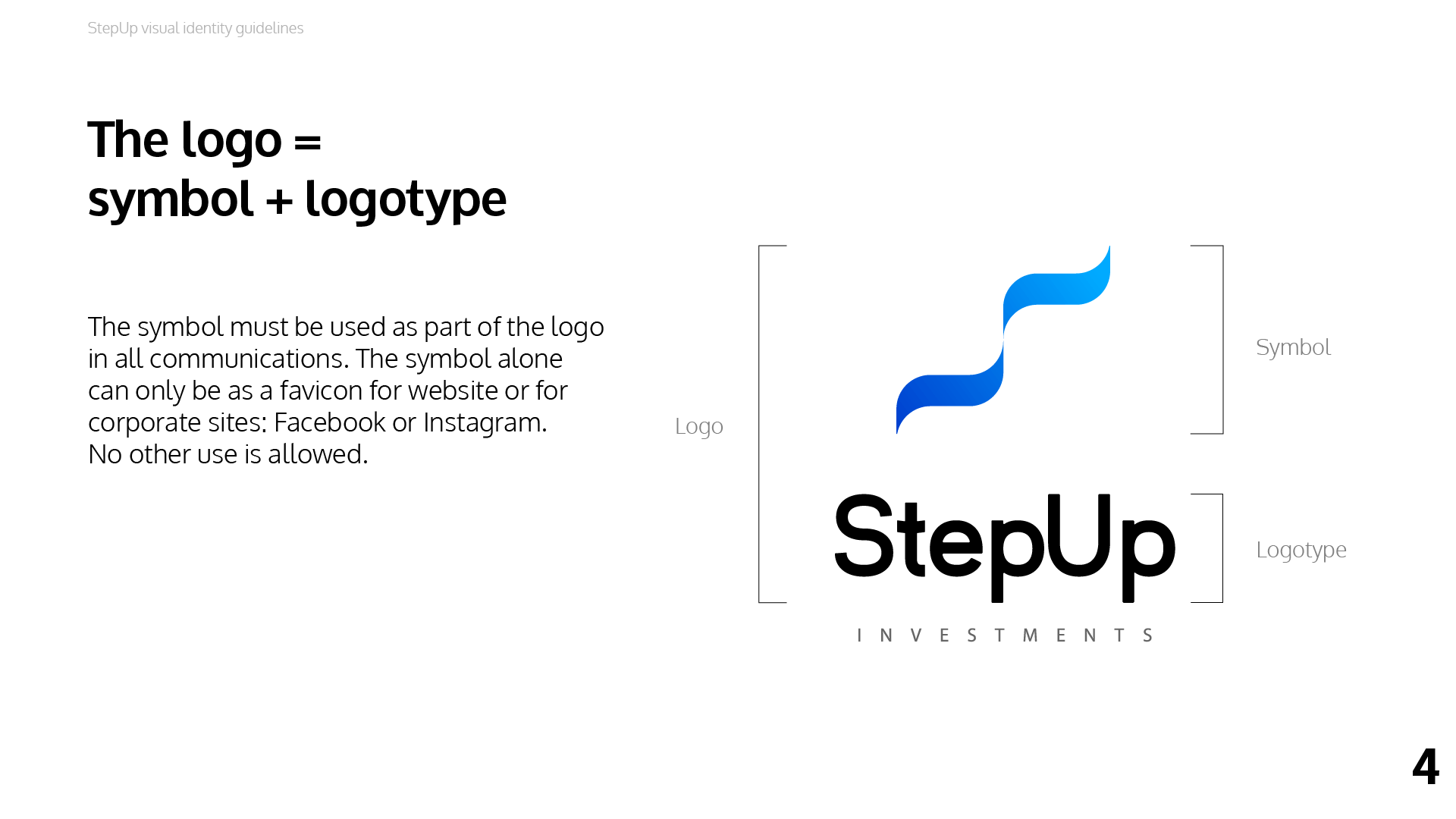
We also developed a Brand Style Guideline Book, which explains every single detail of StepUp’s brand identity and helps us stay true to it.